
How to Analyze and Recreate Any Editing style in Lightroom
Many a time we come across a piece of visually stunning imagery that we adore. We want to capture an image exactly like that or at least develop an existing image using the same style and visual effects.
The problem with all that is that it is not always an easy thing to achieve: looking at an image and then replicating the visual style onto another one. As somebody who has been practicing photography for the last two decades and having shot with film and then moved on to digital photography, I can tell you that there are two aspects to it.
The first thing is to get the exposure right in the camera, which by the way is a lot easier to do with a digital camera compared to an analog camera.
The second thing is to take the image into a photo editing software and manually tweak those editing parameters that give it the final look and feel you are looking to achieve.
In the later part of this discussion, I will explain to you how even with no editing knowledge you can easily achieve this in Lightroom using a preset that you can create on demand. But before that let’s see how you can recreate an editing style in Lightroom using the sliders in the develop module. To do this you need a photo editing software and some idea of how to edit RAW photos.
Things to take into consideration when recreating any editing style in Lightroom:
Exposure
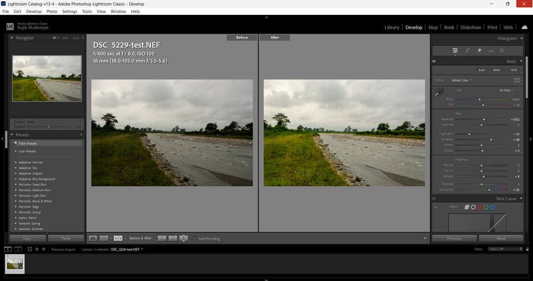
Exposure, by far, is the most important aspect of any photograph. Exposure alone determines how much of the image will be lit and how much of it will be obscured into shadows. The definition of exposure can be summed up as the total of light captured over a period of time.
Most photographers would tell you that there is no such thing as “proper exposure.” Whether you wish to push the exposure above or below what the camera tells you is the proper exposure depends on the mood you are trying to capture and the final result that you’re looking to achieve.
If you want an image to be too bright with highlights blown out and shadows pushed you would try to overexpose the scene by either using the exposure compensation button or if you’re using the manual mode of exposure by opening up the aperture or reducing the shutter speed or both so that an additional amount of light can reach the sensor over a period of time.
Getting the exposure right was the first step towards replicating any style in Lightroom. If your exposure is not on the money your first task would be to get the exposure correct during editing. For example, if the editing style you are trying to recreate is a dark and gloomy image your shadows should be pushed down while keeping your highlights around moderate levels. The overall exposure should also be reduced.
You can achieve a look that is very close to that by using either the exposure compensation button dialled down to reduce the exposure by one to two stops or by using the manual shooting mode and underexposing the scene either by using a faster shutter speed or a smaller aperture or a combination of both.
White balance
One of the most underrated aspects of photo editing is white balance. White balance denotes imparting the right color tone to your images. There are several ways in which you can do this but we are not going to go deeper into that because that is beyond the scope of this discussion. Let’s say you have an image that has an overtly sepia color tone. Sort of like film stock. The original image may not have been shot with the same color tone and the final look has been given in that way to achieve the desired result.
To recreate that style you have to experiment with sliding the white balance slider so that you can achieve that look. The white balance panel has two sliders one is the temperature the other one is the tint. Experiment with both but first I recommend working with the temperature slider.
Highlights and shadows
A couple of aspects of photography that often get overlooked are the highlights and shadows. Most digital cameras come with a highlight warning system that activates and indicates the areas in the image where the highlights have been blown out. It is easy to adjust the exposure and take a second shot.
Considering that you have a highlights warning available on your camera, I suggest that you leave that on for all your photos. Especially for those shots that are taken outdoors in natural light. Modern cameras come with exceptionally high dynamic range, which translates into the ability to pull detail from shadows. In other words, even if your shadows are crushed you would still be able to salvage details out of them during post-processing.
Both highlights and shadows are important because of the image that you are trying to recreate. If the image has its highlights blown out you will have to push the exposure and make sure that the “blinkies” are out.
On the other hand, if the image is dark and gloomy, you need to not only your highlights but also your shadows and mid-tones to replicate the editing style. As mentioned above capturing the image in the camera is just one part of the whole job the rest is done in Lightroom by fine-tuning the highlights and shadow sliders.
Contrast and Dehaze
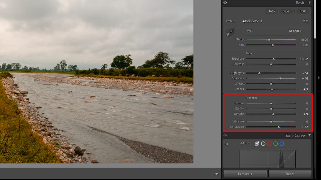
These two sliders are frequently used to edit landscape photography. If you’re fascinated by landscape photography yourself and you’re trying to replicate a style you would be required to use these two sliders often.
First is the contrast slider. It does give a little punch to your photos depending on the dynamic range in the photos. I’m not a big fan of the contrast slider and tend not to use that regularly. The same goes for the saturation and vibrance sliders. But the editing parameter that I use from time to time is the Dehaze option in Lightroom.
The Dehaze slider works both ways and the reason that I use it more often to unsaturate a photograph is because I shoot a lot of landscape photos. I love the overtly dark and gloomy landscape photos where the contrast is pulled down and dehaze is pushed a little up.
Background blur
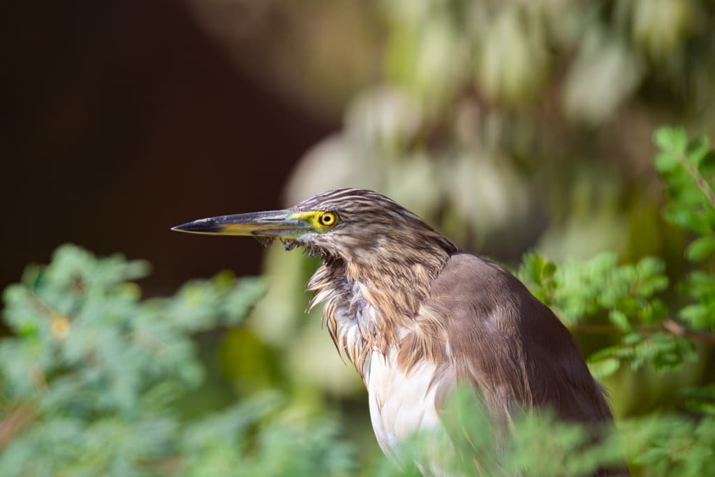
Background blur is a highly debatable topic. Some photographers would love to have extreme amounts of background blur in their photos while others would prefer a more detailed and therefore larger depth of field in their photos. Regardless, several factors determine the presence or absence of background blur in a photo.
The reason why I’m discussing background blur is that many times you will come across images where the composition has a lot of it in the background (pun intended). It becomes necessary for the editing process to take into consideration that aspect.
I believe that the best way to capture background blur in your photos is to capture that in-camera. This is because, no matter how good the editing software is, the resulting background blur, when created artificially, does not look as convincing as it does when it is captured naturally.
If the image editing style you are trying to recreate has a lot of background blur in it, I would recommend that you try to capture a similar image with a similar background blur and then fine-tune the image in Lightroom.
Regardless, I am often inclined to add a bit of background blur in my photos and when I do that I try to do it as subtly as possible never pushing the slider too far. I always make sure that the edges where the subjects end and the background begins, is a subtle transition. If the subject stands out sharply against the background the final result will appear unrealistic.
Light leaks, directional light and other effects
Photo editors often impart additional retouching effects to their photos: these include light leaks, which used to be very common in older analog film cameras, hard directional lighting effects, lens flares and so on. All of these effects can be replicated if you have the right preset with you. Weird lens flares are somewhat natural even in digital cameras, light leaks comparatively, are rare. Even hard directional lighting can be mimicked in Lightroom if you know which slider to work with, plus how to use masking and the gradient tool in Lightroom.
The easiest way to create a preset and replicate any editing style
Well, all that I have discussed above will get you the best possible result it is also the most difficult and most time-consuming of processes. This is because you have to do everything manually using trial and error method.
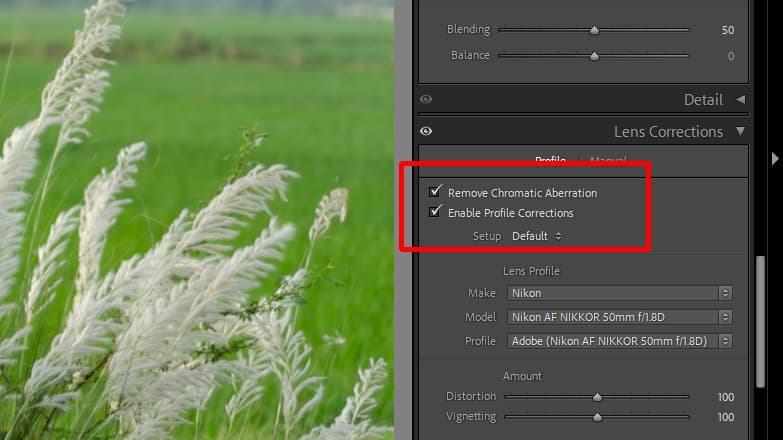
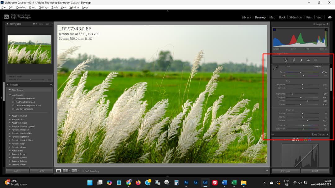
You have to work sliders like these:
Remove Chromatic Aberrations and Enable Profile Corrections
Temperature, Exposure, Highlights, Shadows, Whites and Blacks
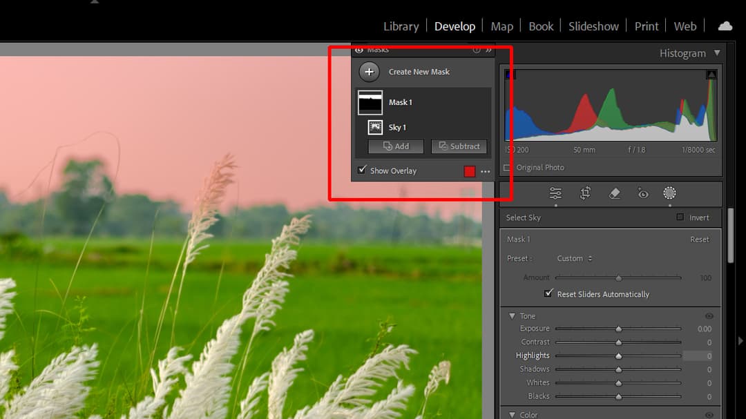
Create Masks
For better control of the adjustment of the sky exposure.
All these and more takes a considerable amount of time to achieve.
Unfortunately, time is a commodity that none of us have in abundance, which means editing everything by hand and replicating often makes no sense, especially when you have something like an AI-powered preset creator like Findpreset.com.
Findpreset.com is a source that allows you to create a preset on demand.
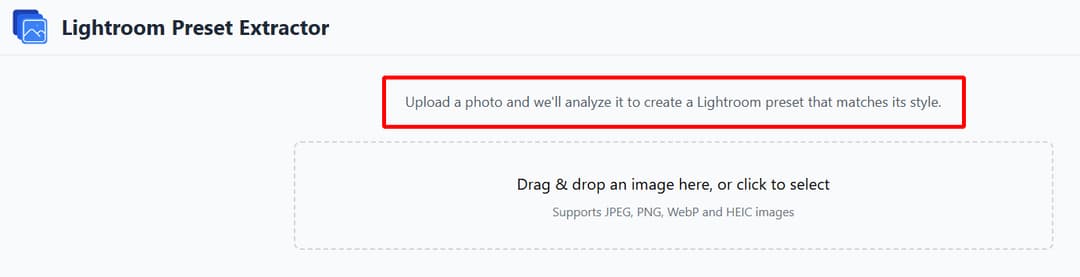
All you have to do is upload an image that you like and the tool will assess the editing parameters used and create a preset that will closely match the editing style of the uploaded image.
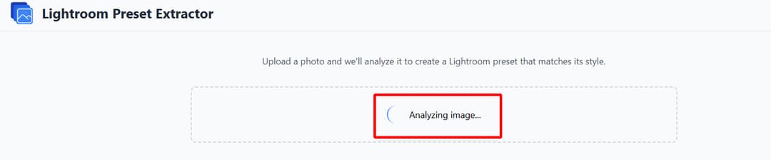
It will not always be 100% accurate but it will give you a good starting platform if you’re looking to replicate an editing style that you like.
You can of course take the preset install it in Lightroom apply it to a photograph you like and then further tweak it. It is a whole lot faster than having to manually adjust the settings and do the trial-and-error method.
The tool accepts most of the popular imaging formats. All you have to do is select an image you like, upload that into the tool, and wait for the magic to happen.
The tool will assess the editing parameters used to create the image and produce a preset that you can download as an XMP file.
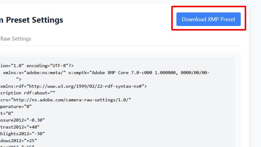
Next, you need to go and import the preset into Lightroom and you are ready to apply it for the next image you want to edit. It is that simple.
Where things get more complicated: hue/saturation and color calibration
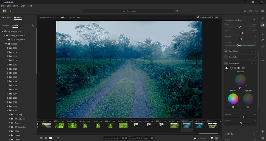
An additional area where things can get complicated is the Hue/Saturation, color grading and color calibration parts. I’ve already discussed white balance adjustments. Color calibration is a slightly more advanced technique.
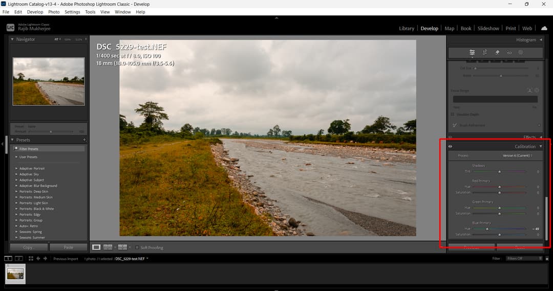
With color calibration in Adobe Lightroom, you can do a lot more finer adjustments using the three primary color channels red, green and blue. The problem is that it is not always a very easy thing to achieve and master. It is very difficult for an untrained eye to spot that a photo requires oversaturated yellow or undersaturated green in order to mimic the same look and feel. It is a lot easier to use a preset that gives your photos an instant color shift with a simple mouse click. This is where Findpreset.com comes into the picture. The tool can easily identify when there are color shifts in an image and take them into consideration when creating a preset.
What is the toughest things that many photographers find it difficult is to mimic a specific hue and saturation effect that they see in a picture. Dialing the exposure settings is a lot easier compared to adjusting the hue and saturation in a photograph, especially when it comes to matching a photograph to something that they love.
Why is it hard to recreate the style of an image I admire?
Replicating the visual style of an image is it difficult in Lightroom because you have to analyze a lot of parameters that have been tweaked in order to render a particular look and feel.
What are the key things I should focus on when editing to match a specific style?
You need to focus on the exposure, white balance, highlights and shadows, contrast and dehaze, whites and blacks among other parameters.
What is the most important setting to get right in-camera?
Exposure is the most important parameter that you should get right in the camera.